Viewing Microsimulation Outputs
Note about licenses: These exercises require a license for Aimsun Next Pro Micro, Advanced, or Expert Edition.
If you have the Pro Meso Edition of Aimsun Next, you can run simulations with the mesoscopic simulator instead of the microscopic simulator. When adding experiments, select the Mesoscopic Simulator.
- Exercise 1. Viewing Vehicle Data During a Simulation
- Exercise 2. Viewing Time Series for Objects
- Exercise 3. Viewing Different Objects in the Time Series Viewer
- Exercise 4. Using View Modes and Styles (I) – View Modes and Legend Window
- Exercise 5. Using View Modes and Styles (II) – Vehicle Speed
- Exercise 6. Using View Modes and Styles (III) – Diagrams
- Exercise 7. Adding Attribute Dynamic Labels
- Exercise 8. Adding Analyzer Dynamic Labels
- Exercise 9. Viewing Centroid Statistics
- Exercise 10. Viewing Lane Statistics
- Exercise 11. Viewing Traffic Control Statistics
- Exercise 12. Viewing Statistics for Grouped Objects
- Exercise 13. Viewing Outputs with Print Layout
- Exercise 14. Comparing Data
Introduction
In these exercises, we will look at several different ways of obtaining visual simulation outputs and of viewing statistics.
We will view data from a single vehicle while running a microscopic simulation. We will use the Time Series Viewer to view data during a simulation. We will define view styles and view modes to present results in the 2D view using colors, shapes, and labels. We will create a print layout to present data, and finally we will compare data from different simulations.
The experiments in these exercises use models from the microscopic simulator. If, instead, you have a license for the Pro Meso edition of Aimsun Next, you should generate the experiments in the ways described but using the mesoscopic simulator rather than the microscopic.
The backup copies of the files related to these exercises are in [Aimsun_Next_Installation_Folder]/docs/tutorials/2_Outputs.
Exercise 1. Viewing Vehicle Data During a Simulation
Note about licenses for this exercise: Available for all editions except the Pro TDM and the Pro Meso editions.
While a simulation is running, information about the status of the network and the vehicles within it is available.
To view vehicle data during a simulation:
-
Open the Aimsun Next file Initial_Outputs.ang.
-
In the Scenarios folder, right-click Replication Base > Run Animated Simulation (Autorun). This starts an animated simulation, visible in the 2D view, and the playback tools are displayed at the top of the window.
-
Use the sliders in the simulation control box to set the smoothness and speed of the simulation.
-
Pause the simulation after at least 10 minutes of simulated time have passed and click the Info icon
 to show real-time simulation data.
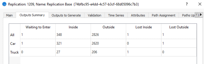
The dialog that is displayed shows the number of vehicles in virtual queues (Waiting to Enter), the number that are currently in the network (Inside), the number that have passed through and left the network (Outside), and the number that have lost their routes (Lost Inside and Lost Outside).
-
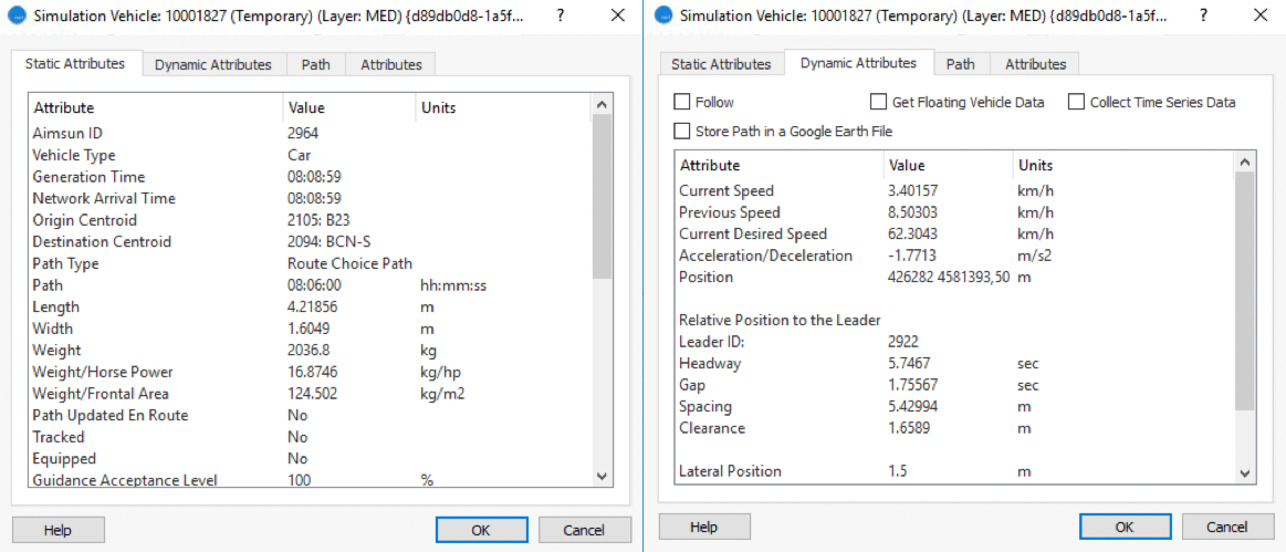
In the 2D view, double-click on a vehicle to display its current attributes.
-
Click on the Static Attributes tab (ID, Origin, Destination, Parameters, etc.) and on the Dynamic Attributes tab (Current Speed, Previous Speed, Acceleration, etc.).
-
Optional: If you want to follow this particular vehicle through the simulation, tick the Follow box.
-
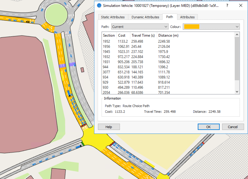
To view the vehicle's path through the network, click the Path tab and from the Path drop-down list select Current and then pick a display Color.
The path followed by the vehicle from its origin to destination is shown. You can also select Next Sections or Initial from the Path list.
-
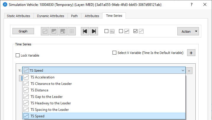
To collect the time series data for the vehicle, click on the Dynamic Attributes tab and tick the box Collect Time Series Data. A new tab named Time Series is added to the dialog.
-
Any vehicle parameter can be shown as it changes over time until it leaves the model. For example, click the variable TS Speed and resume the simulation. Note: If you can't see the variables, you might need to click the Variables button.
-
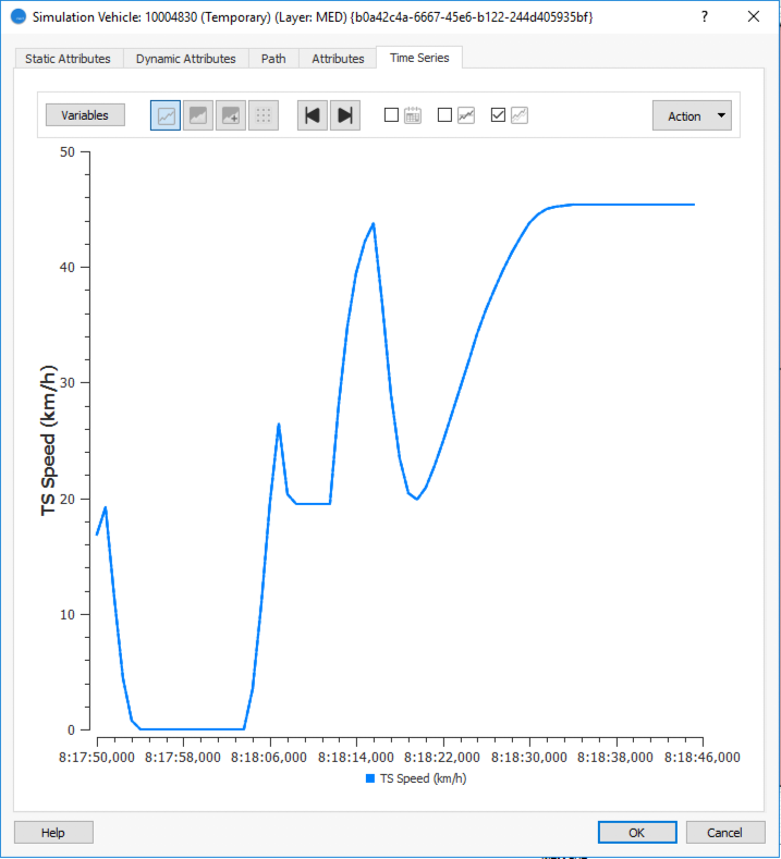
Click Graph to see the time series.
Exercise 2. Viewing Time Series for Objects
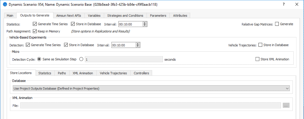
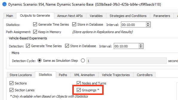
During (microsimulations) and after a simulation, we can view the data collected for each of the objects in the model (sections, nodes, detectors, etc.). In this exercise we will view time series for a detector and a section. The first step is to set the data detection interval as 10 minutes.
To view times series for a detector:
-
Open the scenario Dynamic Scenario Base and click the Outputs to Generate tab. Set the parameters as shown in the screenshot below (note that Interval is 00:10:00).
-
In the Scenarios folder, right-click Replication Base > Run Animated Simulation (Autorun). Run the simulation from start to finish.
-
In the 2D view, double-click on a detector object.
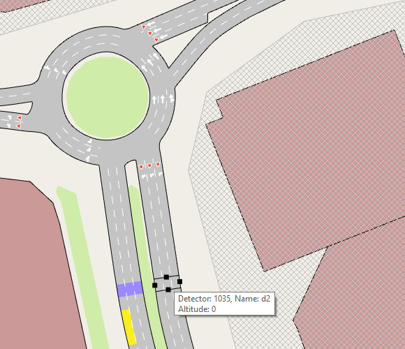
-
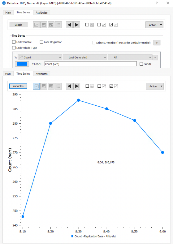
Click the Time Series tab.
-
Click Variables and for the Y axis, select Count and Last Generated.
-
Click Graph to see the detector counts over consecutive 10-minute intervals plotted as a graph.
It is possible to show more than one time series simultaneously. In the next example, we will set the variables so that counts for both car and truck are shown.
To show more than one times series:
-
Click Variables.
-
Click
 and, from the third drop-down list for each Y axis, choose Car for the first time series and Truck for the second one, as shown below.
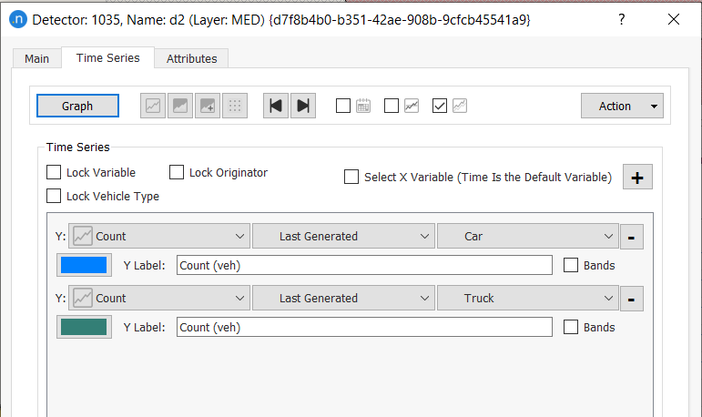
-
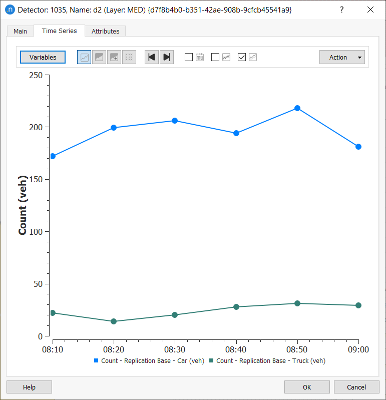
Click Graph to show both series in graph form.
You can visualize time series for any network object. For example, the screenshot below shows the mean number of stops that vehicles make in a selected section per interval.
To view time series for a section:
-
Open a section (our example is Section 933).
-
Click the Time Series tab.
-
Tick the Mean option
 to display a dotted line representing the mean across the duration of the simulation.
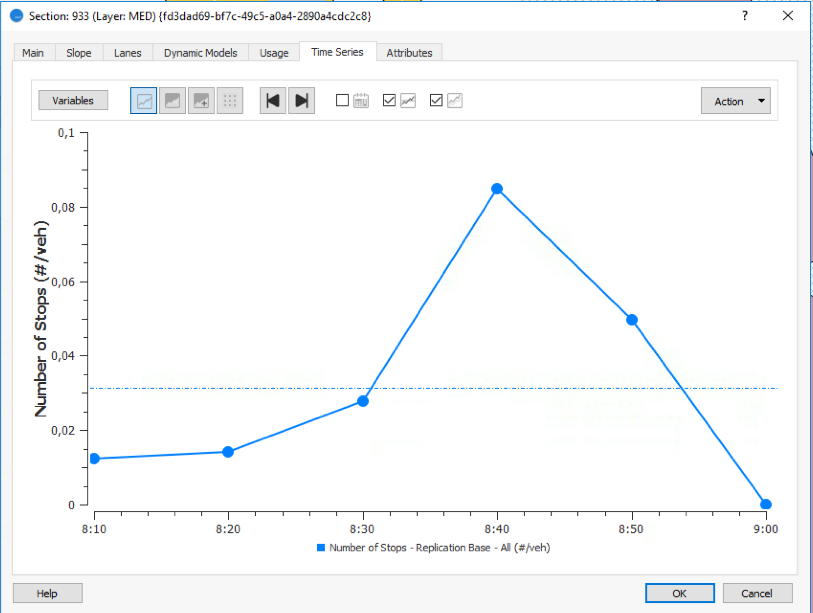
You can also display time series that are expressed in common (and even different) units.
-
To set the variables below, click
and select Density and Flow for the two Y axes.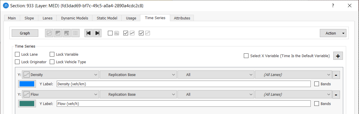
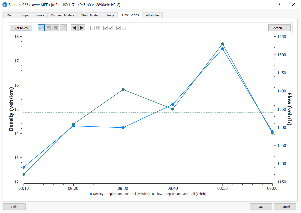
-
Click Graph to see the plotted time series.
Exercise 3. Viewing Different Objects in the Time Series Viewer
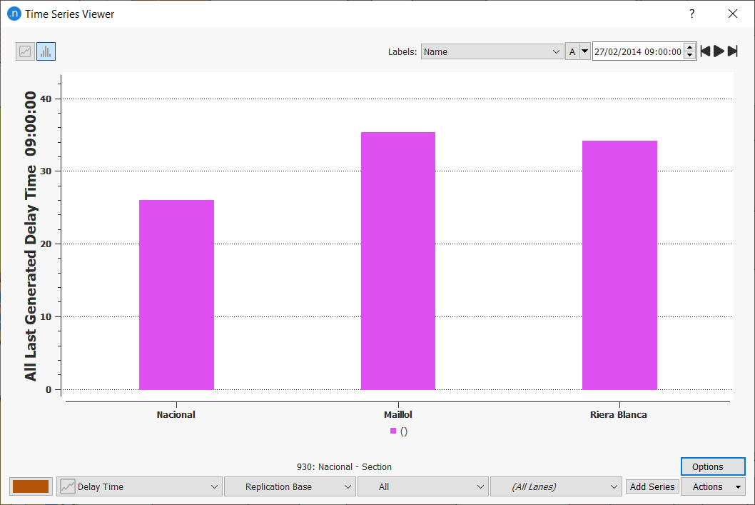
It is also possible to show time series for more than one object in the same graph. In this exercise we will use the Time Series Viewer to compare the delay time in different sections leading into a junction (node).
Tip: For this to work, you must have run the simulation and generated outputs.
To view different objects in the Time Series Viewer:
-
Select Data Analysis > Time Series Viewer.
-
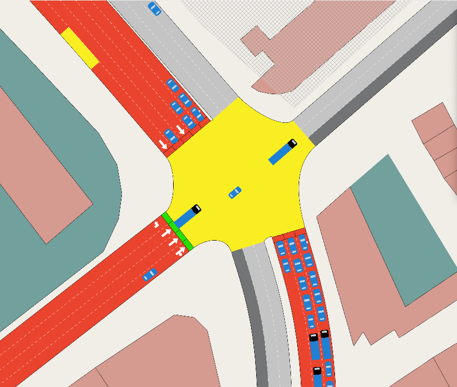
With the Time Series Viewer open, select the three approaches to the junction shown in the screenshot below.
-
At the bottom of the viewer, select Delay Time and Last Generated.
-
Click Add Series to add the Delay Time data for each section to the graph.
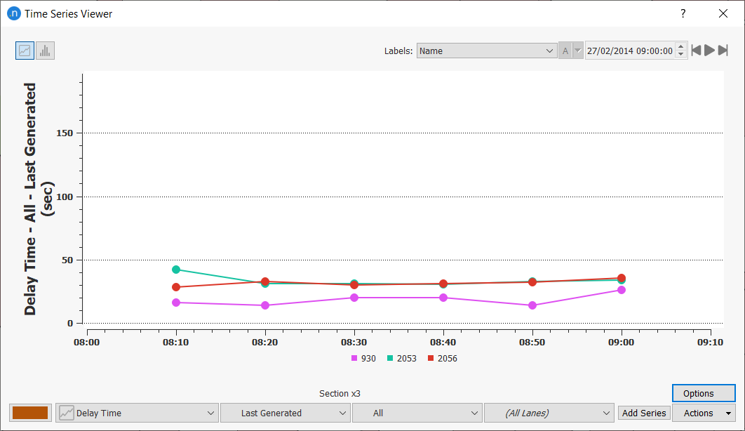
-
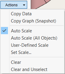
Optional: If the scale doesn't look clear, from the Actions drop-down menu select Auto Scale to adjust.
-
To see the result expressed as a bar chart, click
 .
.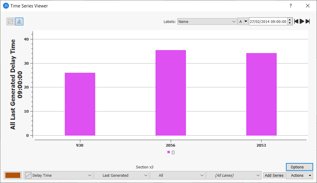
This allows us to see the values of the three sections in a fixed period of time, in this case at 09:00:00. However, we can see the values from different intervals by using the play, forwards and backwards controls to the right of the clock.
To see the values from different intervals:
-
Click the play button to show the progression of the statistics from the beginning to the end of the simulation.
-
Click the forwards and backwards buttons to step through the simulation one interval at a time.
-
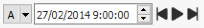
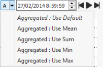
To view aggregated values: mean, sum, min, and max, select them from the drop-down list labeled A.
-
To make it easier to identify objects in the graph legend, select an option from the Labels drop-down list. The screenshot below displays the names of the sections.
Exercise 4. Using View Modes and Styles (I) – View Modes and Legend Window
Aimsun Next comes with many ready-made view modes and styles that visualize network conditions and outputs. Some are useful during a simulation, some while calibrating a model, and others are useful for observing results during and after a simulation.
In this exercise we will look at some view modes and alter views using the Legend window (Window > Windows > Legend). You can also toggle the Legend window on and off by clicking in the 2D view and typing e.
In the first part of this exercise we will look at three view modes, which are PARAMETERS: Capacity Sections, CALIBRATION: Color by Turn, and Simulated Flow.
4.1 View Modes
To activate the three view modes:
-
At the top of the 2D view, from the View Mode drop-down field, select PARAMETERS: Capacity Sections.
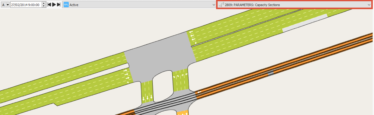
The network is updated with a visualization of the capacity in sections. The Legend window contains the color key that relates to the visuals.
-
Optional: If you want to show all unaffected objects in gray scale, select View > Gray Mode. This makes the objects you are interested in more prominent.
-
Select the view mode CALIBRATION: Color by Turn.
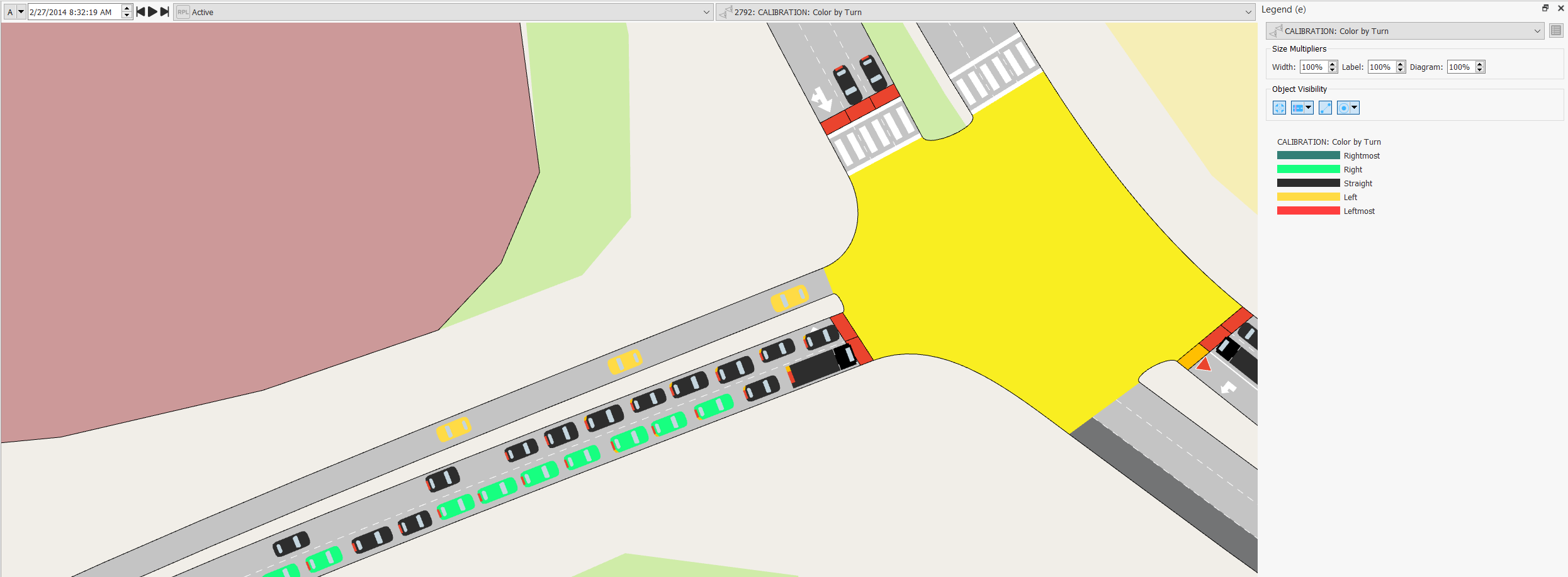
In this view mode, vehicles are colored by their intended turn.
-
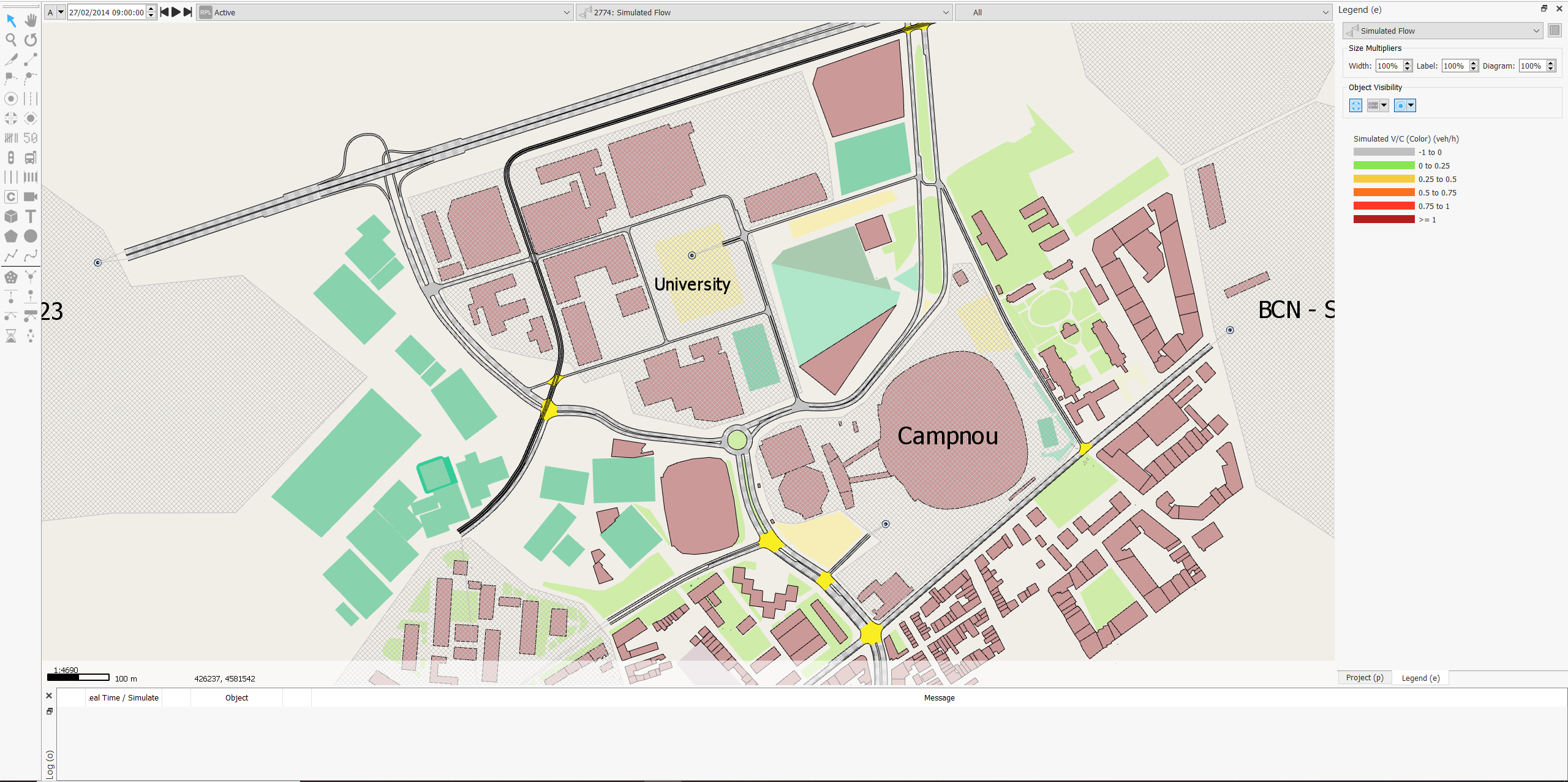
Select the view mode Simulated Flow.
-
Optional: Because this view mode varies over the time of the simulation, we can use the clock to see different results over time and to display different aggregated values, as covered in Exercise 3.
-
To visualize by lane number (1, 2, 3, etc.), select the lane number from the Lane drop-down list.
4.2 Using the Legend Window to Modify View Modes and Styles
The Legend window enables you to modify elements of view modes and styles without having to access them individually.
To use the Legend window:
-
Show the Legend window, as described earlier.
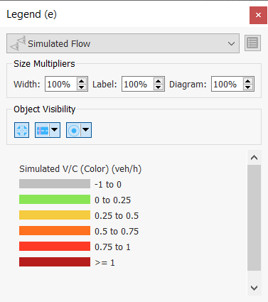
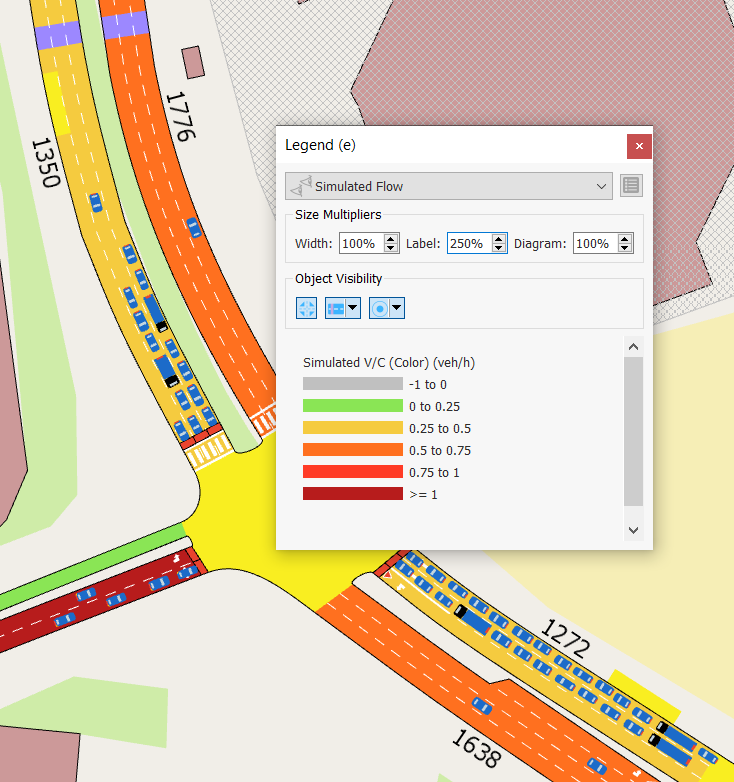
Under Size Multipliers, there are Width, Label, and Diagram parameters that you change to increase or decrease the size of elements in a view mode.
-
Increase Label to 250%. Labels will expand as in the screenshot below.
-
Increase Width to 200% to widen the visualizations on sections, as below.
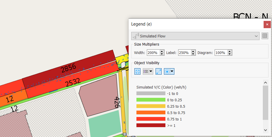
-
Try different values to find the right combination to display information clearly.
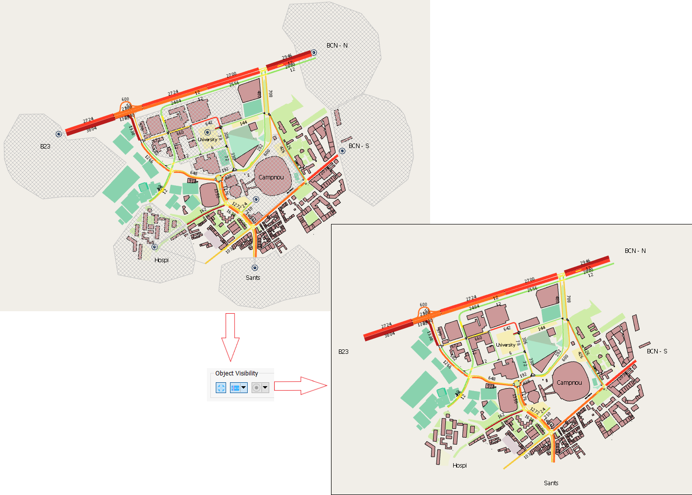
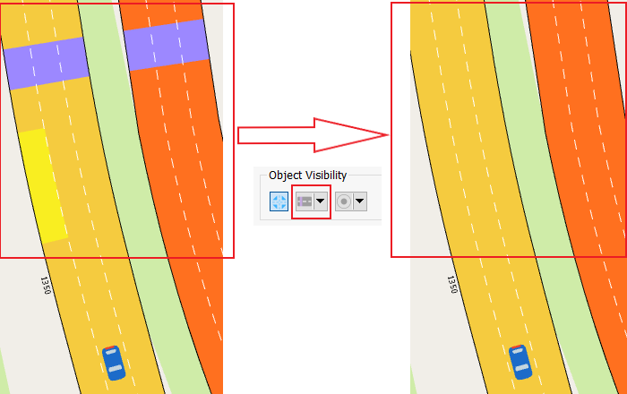
Under Object Visibility, there are three icons that enable you to show or hide objects in the network view.
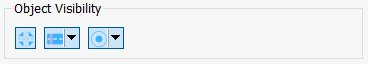
To show or hide objects in the network view:
-
Click
 to show or hide all nodes.
 -
Click
 and select which objects you want to show and which you want to hide.
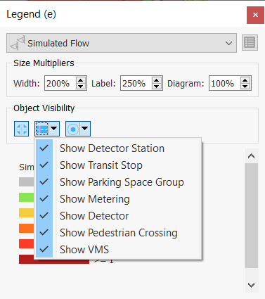
-
Click
 to show or hide centroids as polygons, points, both, their connections to transit stop, or their non-transit-related connections to road sections.
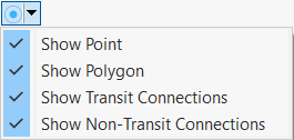
Using these icons in combination, you can select exactly the elements of a network that are relevant to your analysis. The first screenshot below shows a network with centroids and connectors hidden. The second screenshot shows a section after detectors and a transit stop have been hidden.
If you want to edit view modes and view styles directly, you can access them from the Legend window.
To access view modes and view styles from the Legend window:
-
To open a view style, click on the color range in the Legend window. The relevant View Style dialog opens.
-
To open a view mode, click
 . The relevant View Mode dialog opens.
Exercise 5. Using View Modes and Styles (II) – Vehicle Speed
Note about licenses for this exercise: Available for all editions except the Pro TDM and the Pro Meso editions.
In this exercise, we will create a view mode that assigns colors to vehicles according to their current speed.
To create a new view mode:
-
In the Project folder, right-click View Modes > New View Mode.
-
Open the new view mode and rename it Vehicle Speed.
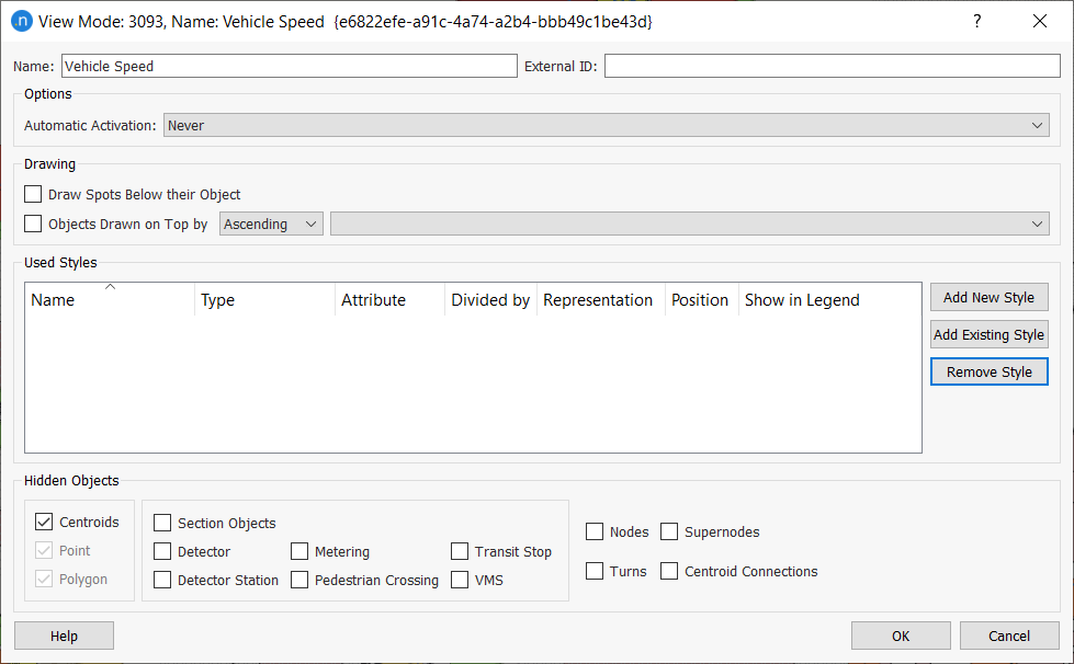
-
Click Add New Style. A new View Style dialog is displayed. Note that it is named after the view mode Vehicle Speed but with style 1 appended.
-
For Objects of Type, select Simulation Vehicle.
-
For Style, select Color.
-
For Attribute, select Current Speed.
-
Click New four times to add four color ranges to the dialog.
-
For each color range in turn, click to highlight it and then:
i. Enter Range values to match the screenshot below.
ii. Under Symbol Editor, click on Color and pick a color for the range from the palette. Use the screenshot as a guide.
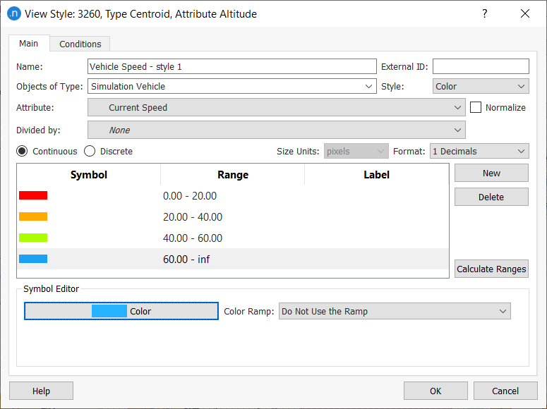
-
Click OK.
-
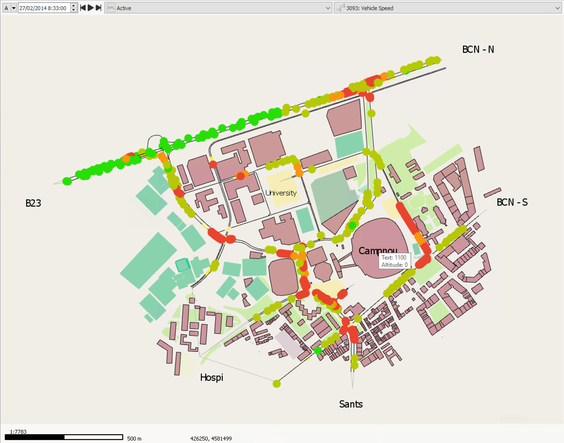
Select Vehicle Speed as the current view mode. It should look similar to the screenshot below. You might need to run the simulation if you currently have no outputs.
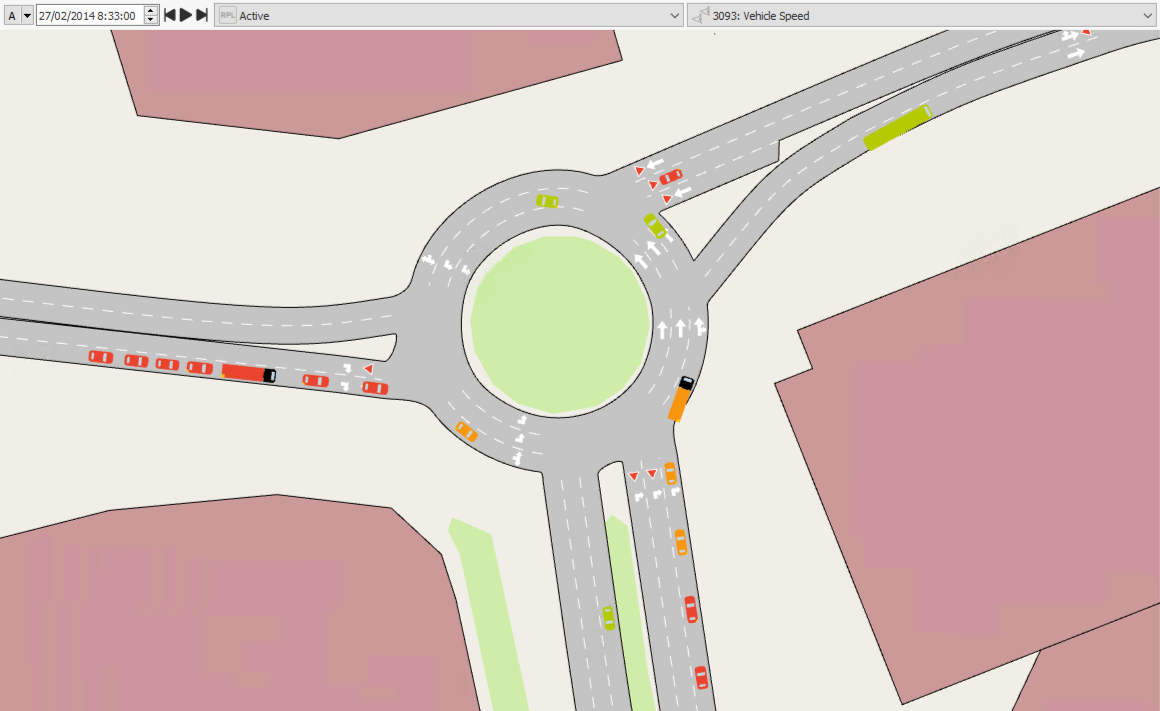
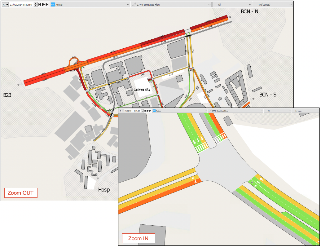
This looks good at the current scale but if we zoom out to 1:4000 or further it becomes difficult to see the individual vehicles.
To fix this, we can create a second view style that shows the vehicles as dots from 1:4000 and upwards.
To create the second view style:
-
Open the Vehicle Speed view mode.
-
Click Add New Style to create the second view style. A new View Style dialog is displayed.
-
For Objects of Type, select Simulation Vehicle.
-
For Style, select Spot.
-
For Attribute, select ID.
-
Click New to add a symbol to the dialog (this will visualize the Spot style).
-
Click in the Symbol cell to highlight it and for Range enter 0.00–inf.
-
Under Symbol Editor, set the following inputs:
i. For Spot Type, select Circle.
ii. For Size, enter 8.
iii. For Color, select Use Object's Color.
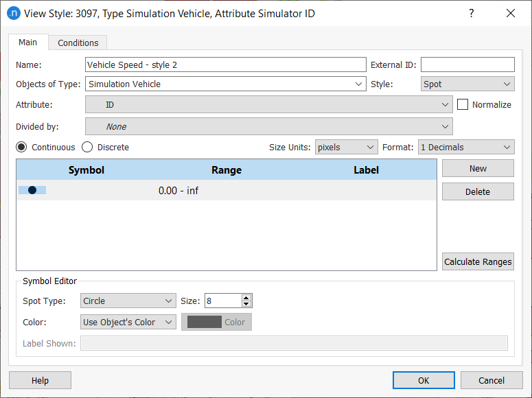
-
Click the Conditions tab.
-
Tick the Scale box and set the two Between values to 4000 and then 9999999. This means that the style will only be activated when the scale is between 1:4000 and 1:99999999.
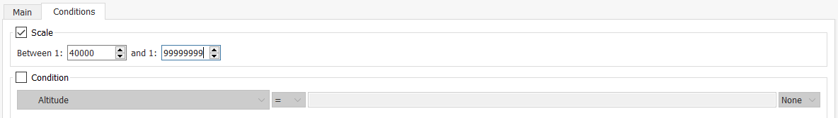
Depending on the zoom level in the 2D view, either the first or second view style will be displayed automatically. The screenshot below shows the spot types that we configured for use above 1:4000.
Exercise 6. Using View Modes and Styles (III) – Diagrams
Note about licenses for this output: Available for all editions except the Pro TDM and the Pro Meso editions.
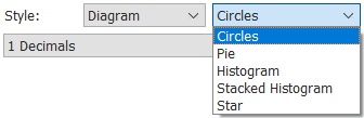
The Diagram style enables you to use circles, pie charts, histogram, stacked histograms, and stars to add value labels to visual outputs.
We are going to look at the use of diagrams with centroids and transit vehicles.
6.1 Centroids
In this exercise, we will use the diagram style to display the number of origin/destination trips for each of the centroids.
To use diagrams with centroids:
-
In the Project folder, right-click View Modes > New View Mode.
-
Open the new view mode and rename it Total Demands.
-
Click Add New Style.
-
For Objects of Type, select Centroids.
-
For Style, select Diagram and Histogram.
-
From the Available Columns list, select Demand Totals and click the green arrow twice to move two items to the Selected Columns list (one for origins and one for destinations).
-
For the first item in Selected Columns, select Origin from the drop-down list.
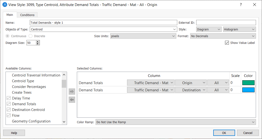
-
Optional: For each item, click in the Color cell and pick different colors from the palette.
-
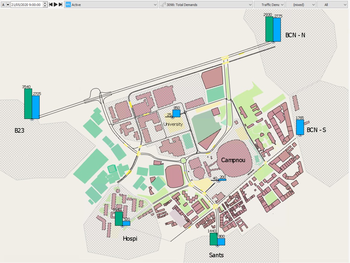
Select the Total Demand view mode.
The results should resemble the following screenshot.
Using information from Exercise 4, experiment with changing the size of the histogram, colors, labels, and the centroid attributes in the Available Columns list.
6.2 Transit Vehicles
To emphasize the movement of transit vehicles in a simulation, we can visualize them as circles with diameters relative to the size of the vehicle type.
To use circle diagrams with vehicles:
-
Create a new view mode and rename it: Transit Vehicles.
-
Click Add New Style. A new View Style dialog is displayed.
-
For Objects of Type, select Simulation Transit Vehicle.
-
For Style, select Diagram and Circles.
-
For Diagram Size, enter 30 (pixels).
-
From the Available Columns list, select Length and click the green arrow to move it to the Selected Columns list.
-
For Length, click in the Scale cell and enter 12.
-
Optional: Change Color if required.
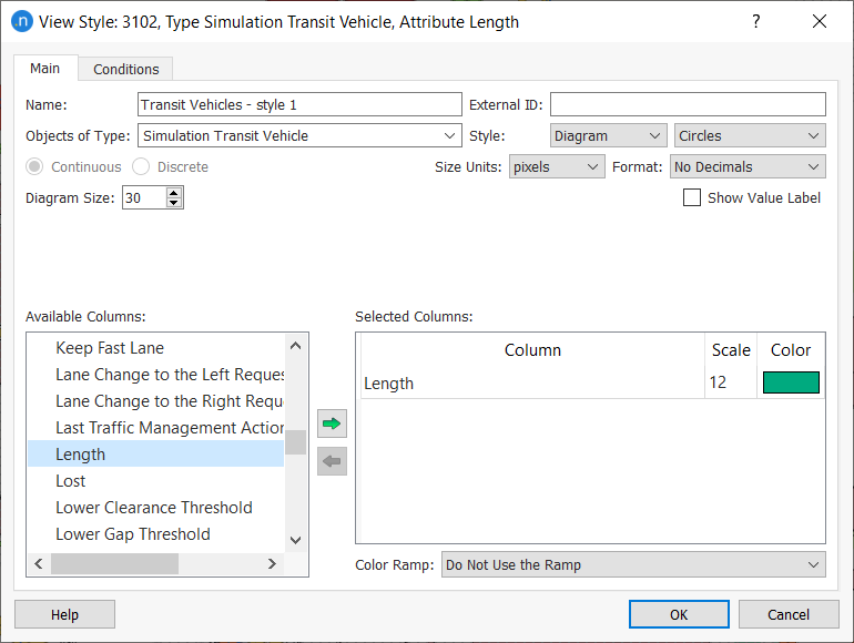
-
Click OK.
-
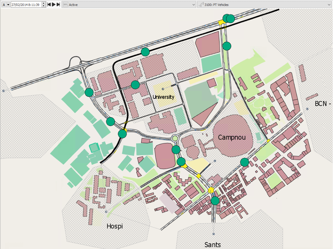
Select the Transit Vehicles view mode.
The results should resemble the following screenshot.
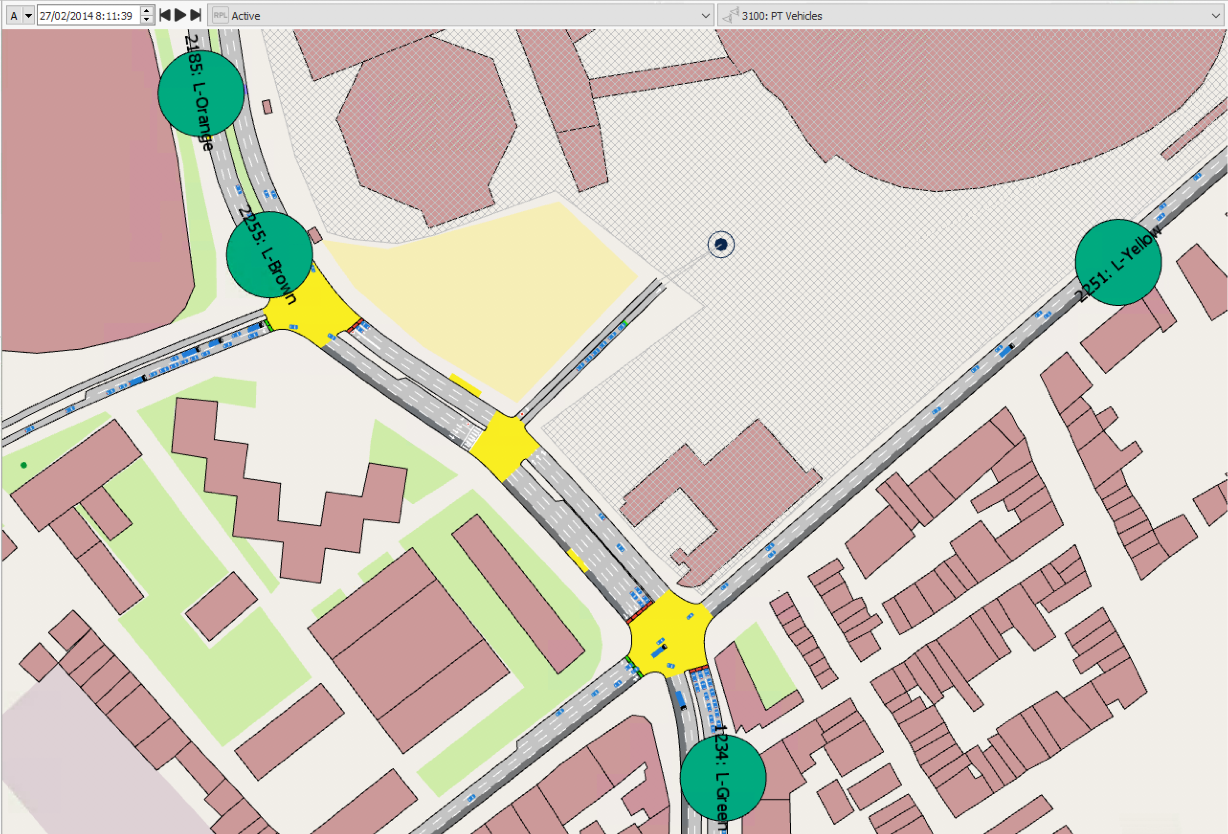
To show the transit line for each bus in the network, you can add a new view style to the view mode. To do so, repeat the steps above but make these changes starting with from 4:
- For Style, select Attribute.
-
For Attribute, select Transit Line.
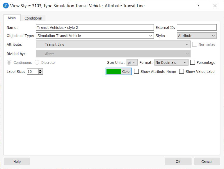
The results should resemble the following screenshot.
Exercise 7. Adding Attribute Dynamic Labels
Objects in 2D views can be given dynamic labels to display attributes that change value during a simulation. Such values might be the mean speed in a section, or a detector's occupancy; the possibilities are wide-ranging.
In this exercise we will add a dynamic label to a detector to display changing vehicle counts.
To add a dynamic label:
-
Find the relevant detector in the model and click on it once.
-
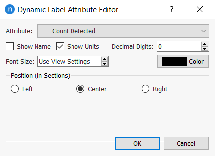
Right-click on the detector and select Dynamic Labels > New > Attribute Dynamic Label. The new label's dialog is displayed.
-
For Attribute, select Count Detected.
-
Tick the box Show Units.
-
Optional: click on Color and pick a unit color from the palette.
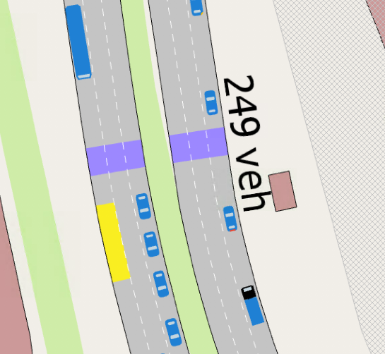
The dynamic label text will appear in the 2D view and change as values change during simulation.
To tidy up the display, click and drag the label to move it to an effective position.
If you want to make changes to a label, double-click directly on it to open its dialog.
Exercise 8. Adding Analyzer Dynamic Labels
For a node, we can run an analysis of all its turns and display the results in a dynamic label. These work in a similar manner to those described in Exercise 7. For this experiment we will select Count as the output we want to display.
To add an analyzer dynamic label:
-
Find the relevant node in the model and click on it once.
-
Right-click on the node and select Dynamic Labels > New > Analyzer Dynamic Label. The new label's dialog is displayed.
-
For Attribute, select Count and Last Generated.
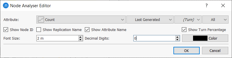
-
Click OK.
During a simulation, the results should resemble the screenshot below.
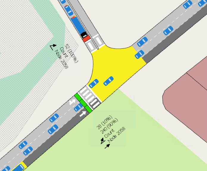
Try other values and parameters for this kind of dynamic label.
Tip: Turn off other layers in the Layers window to make the 2D view, and any labels, clearer.
Exercise 9. Viewing Centroid Statistics
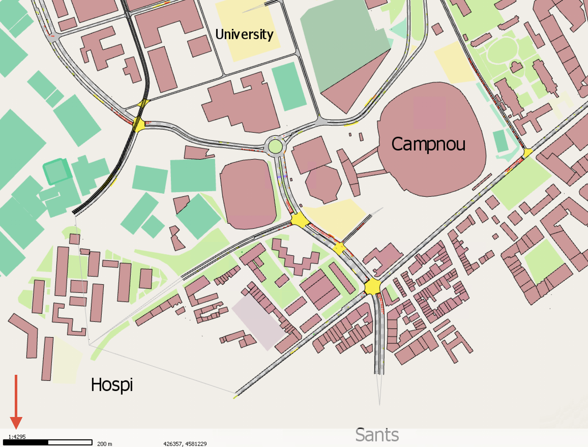
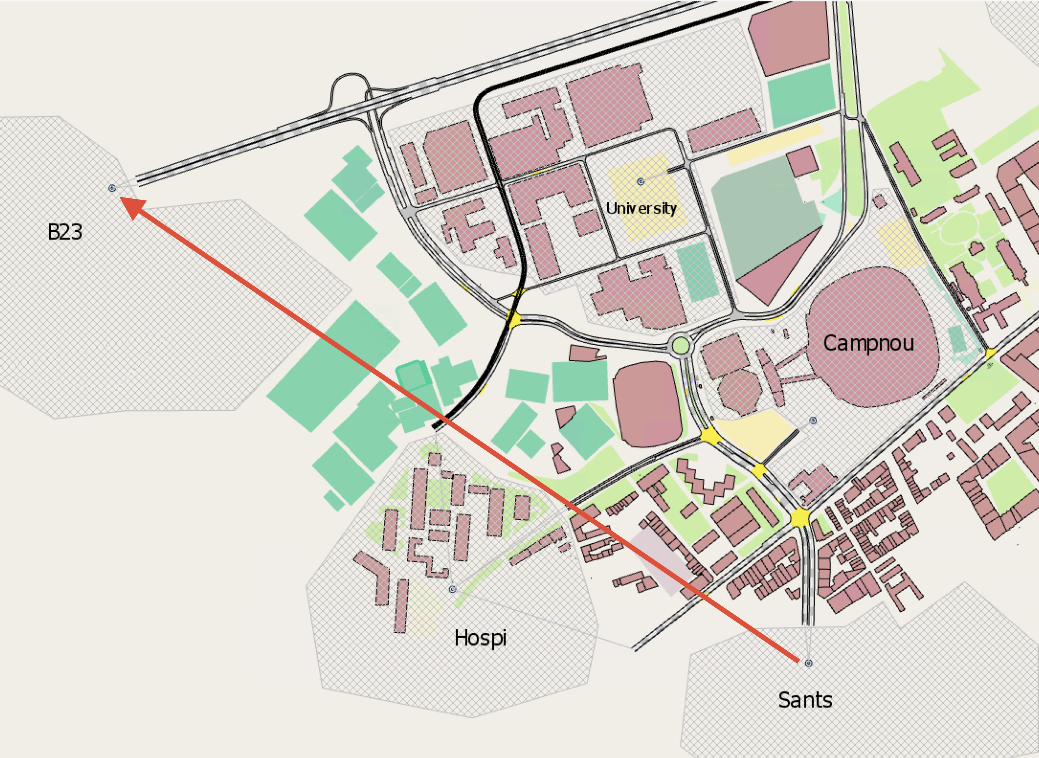
You can view the statistics of centroids by double-clicking on the centroid you are interested in. This exercise looks at the Sants centroid and two examples of available statistics: stats on a single centroid and stats about an OD pair.
To view single centroid statistics:
-
Double-click the Sants centroid.
-
Click the Time Series tab.
-
Using the steps described in Exercise 3, add two time series variables with the same units. Use the two screenshots below as a guide.
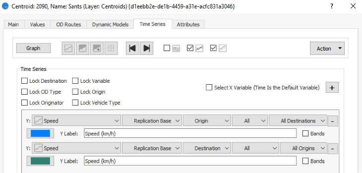
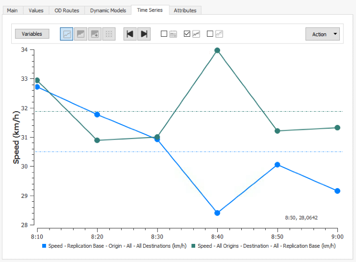
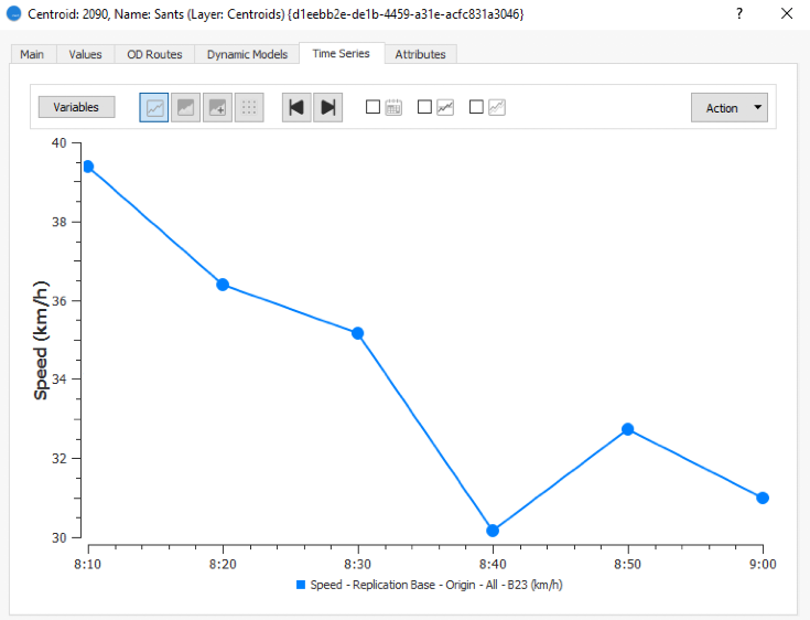
Now we will look at statistics for an OD pair, specifically the average speed of vehicles that have traveled from the Sants centroid to the B23 centroid (shown below). Keep the Centroid dialog open on the Time Series tab.
To view OD pair statistics:
-
Click Variables.
-
For the Y axis, select Speed, Replication Base, Origin, All, and B23 (the destination centroid).
-
Click Graph to see the statistics in graph form.
Exercise 10. Viewing Lane Statistics
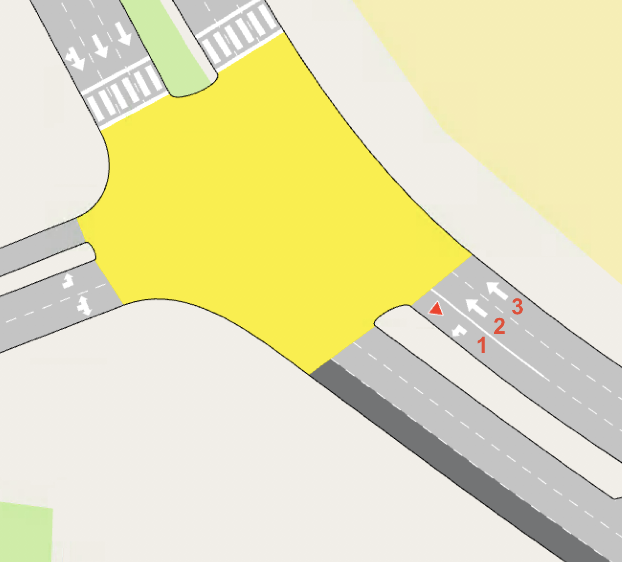
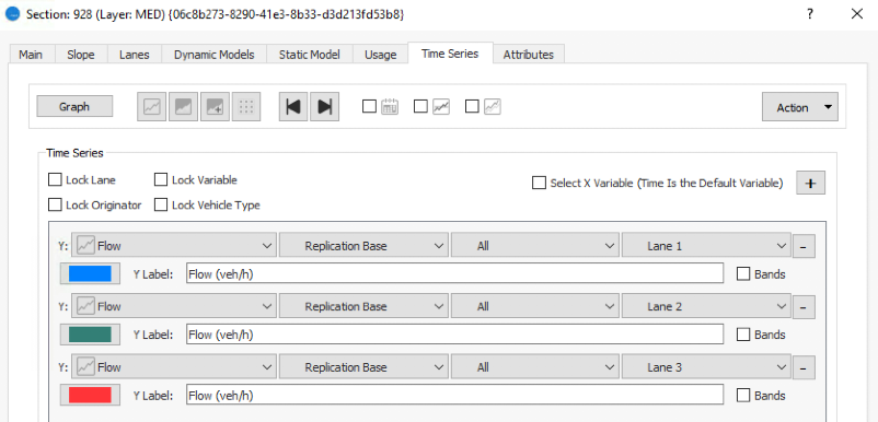
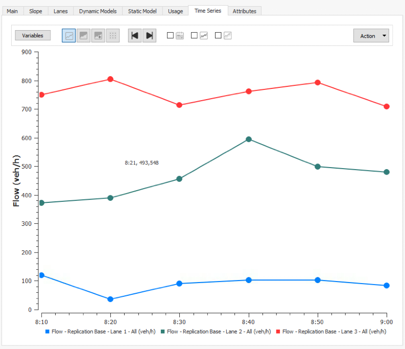
In this exercise we will view the statistics of individual lanes within a section. We will focus on Section 928, pictured below. Note that Lane 1 is the left-most lane according to the direction of traffic.
If necessary, use Find (Ctrl+F) to locate the section. Again, for this exercise, use the methods we covered in Exercise 3 for adding variables.
To view lane statistics:
-
Double-click on Section 928 and click the Time Series tab.
-
Click Variables and add three variables (one for each lane of the section).
-
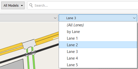
For each variable, select Flow and a lane (Lane 1, Lane 2, Lane 3).
-
Click Graph to show the statistic for each lane in graph form.
Exercise 11. Viewing Traffic Control Statistics
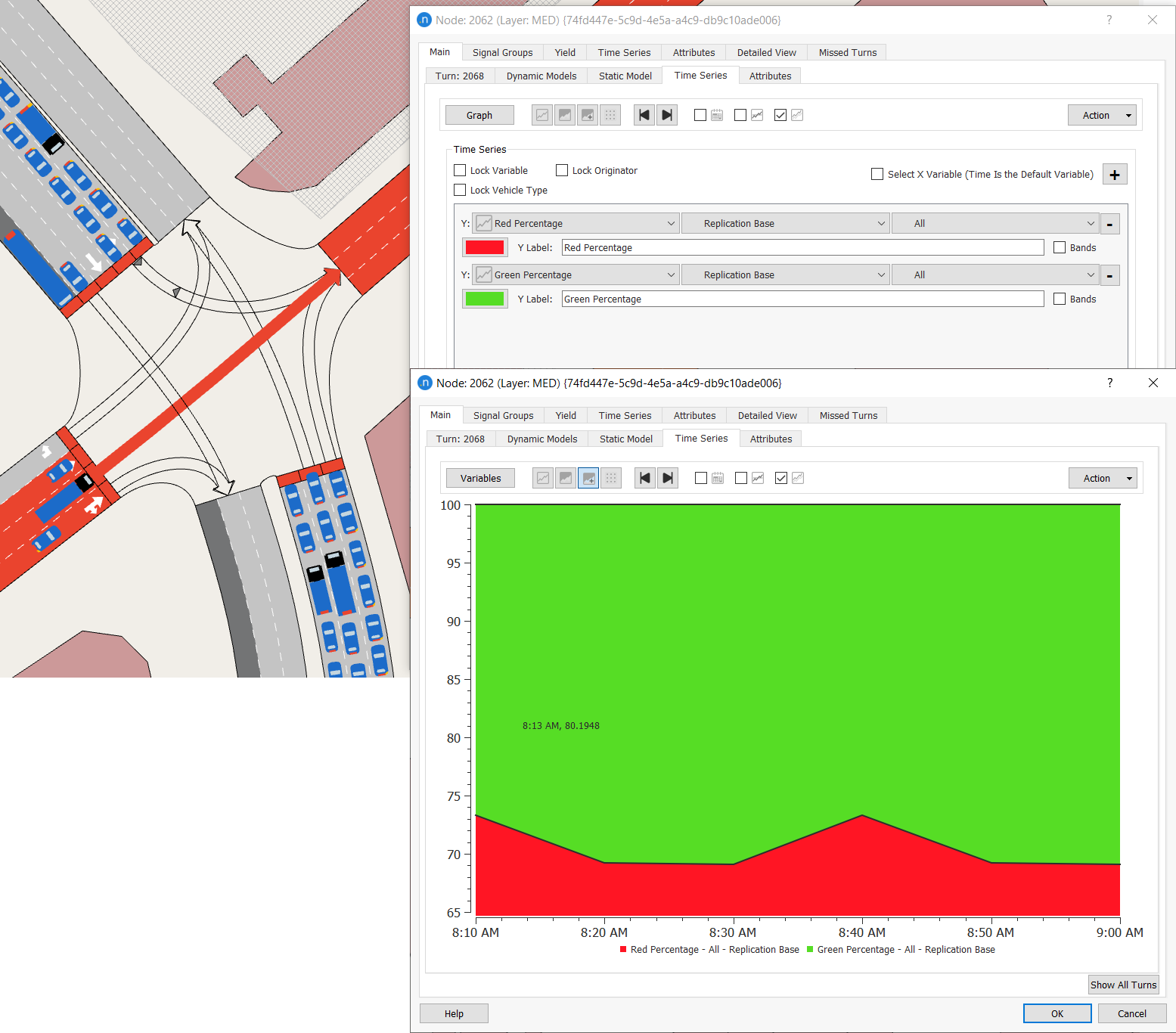
In this exercise, we will view traffic control statistics, being the percentage of red/green time for signals. We will also create a view mode with pie chart diagrams to visualize the statistics as the simulation runs.
Signal information is contained in the turns of a node because the proportions of red and green signal time are specific to each turn. We will focus on Node 2062 (again, you can use Ctrl+F to find it if required).
To view traffic control data as a time series:
-
Double-click on Node 2062 to open its dialog.
-
On the Main tab, select a turn with a signal (it will be highlighted in the 2D view) and click Edit Turn. A series of new subtabs is displayed.
-
Click on the Time Series tab.
-
Click Variables and add two variables: Red Percentage and Green Percentage. These add up to 100% so a stacked area graph is a good format for the data.
-
Click Graph and click
 .
.
The results should resemble the screenshot below (we have overlaid the Graph and Variable subtabs for illustration purposes).
We can create a similar display in the 2D view by using a view mode.
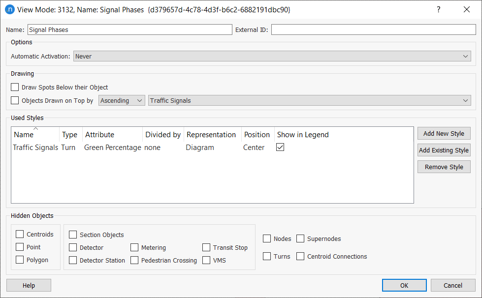
To create a view mode to display traffic control statistics:
-
In the Project folder, right-click View Modes > New View Mode.
-
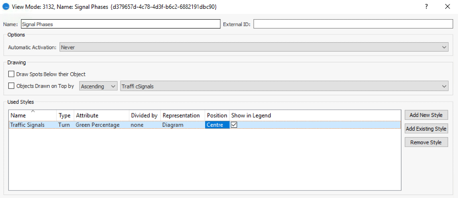
Open the new view mode and rename it Signal Phases.
-
Click Add New Style. A new View Style dialog is displayed.
-
Rename the style Traffic Signals.
-
For Objects of Type, select Turn.
-
For Style, select Diagram and Pie.
-
From the Available Columns list, select Green Percentage and click the green arrow to move it to the Selected Column list. Do the same for Red Percentage.
-
For each percentage, double-click Color and pick green and then red to match the signals.
-
Click OK to return to the Signal Phases dialog.
-
Click OK to close.
-
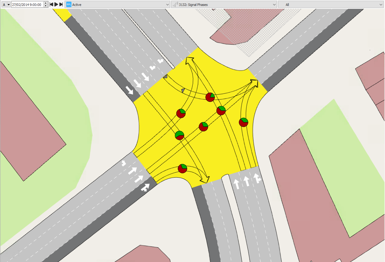
Select the Signal Phase view mode.
The signal phases per turn are displayed in the 2D view.
Exercise 12. Viewing Statistics for Grouped Objects
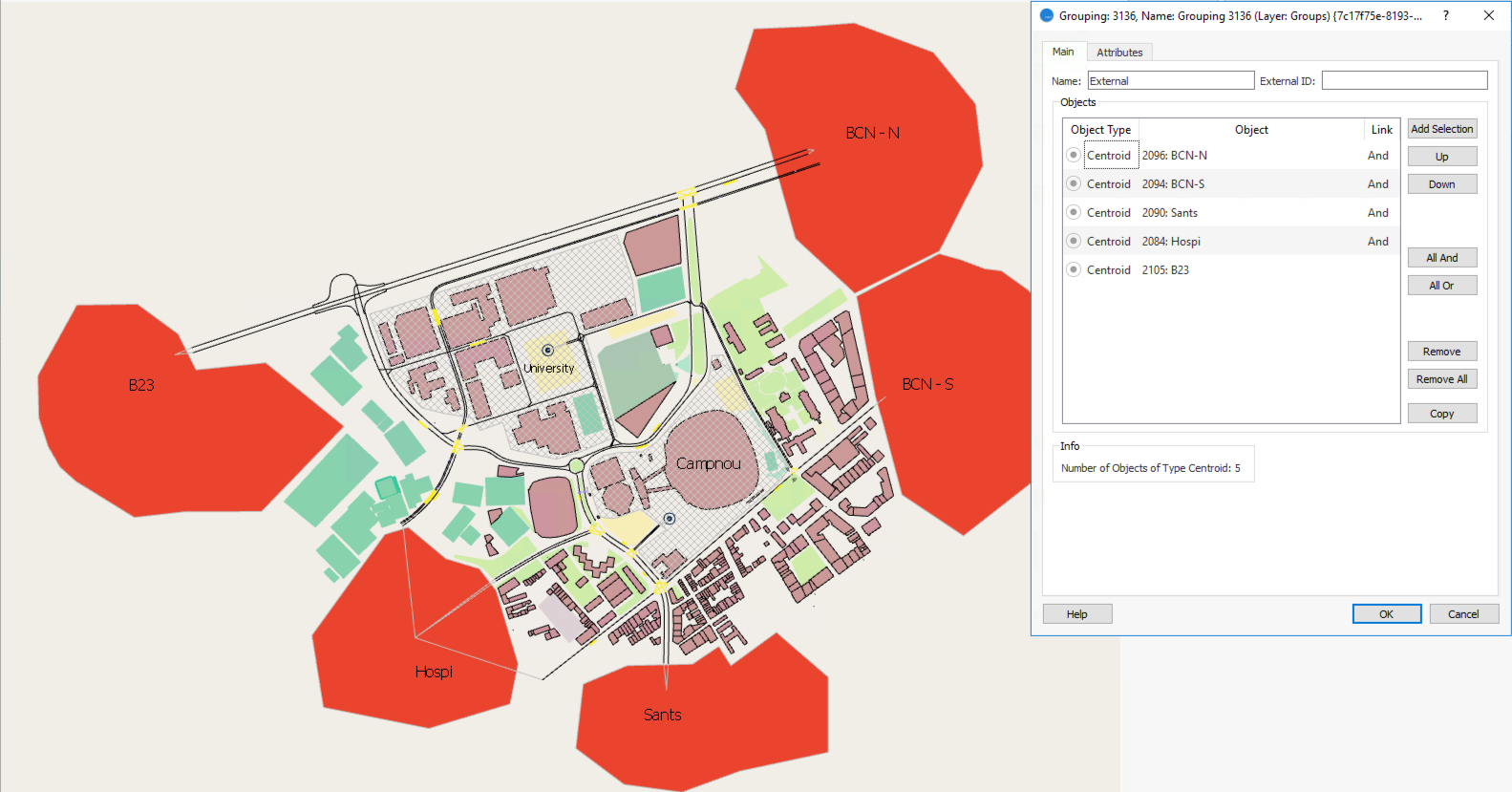
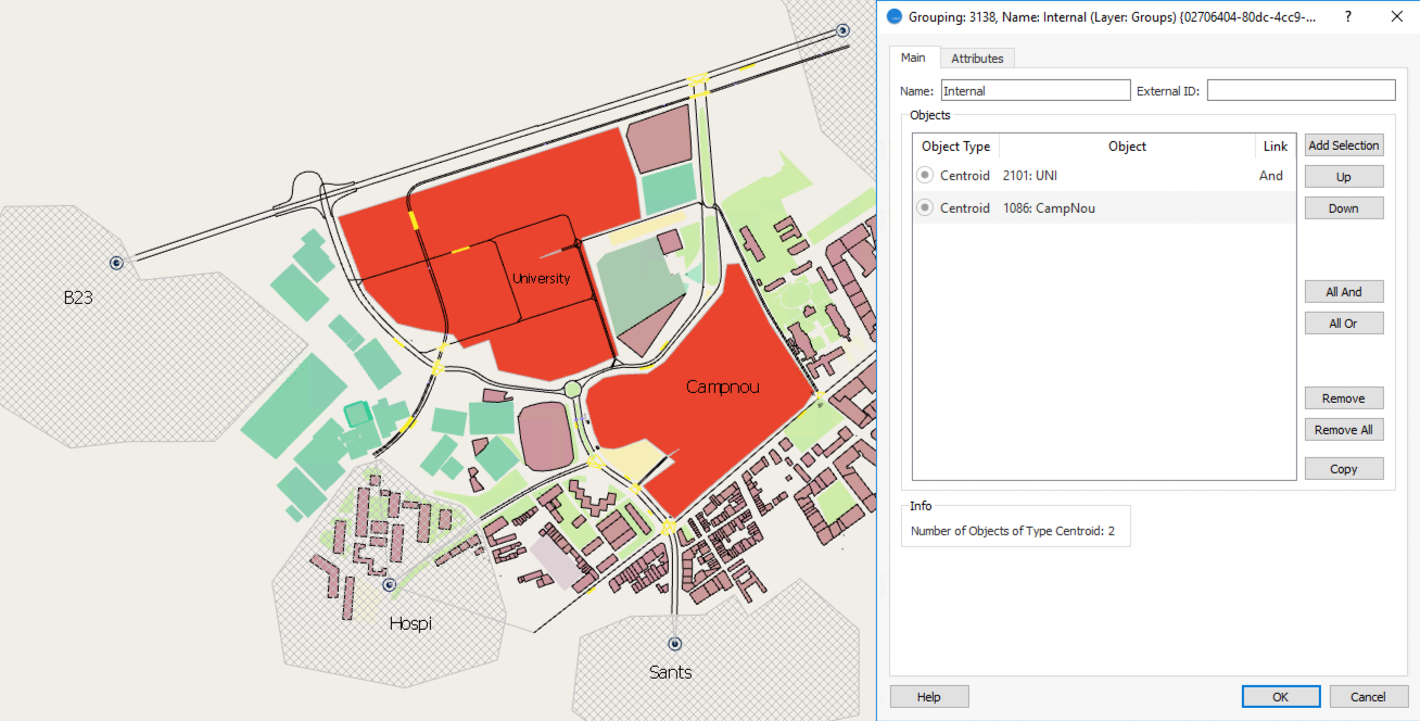
In this exercise we will group objects of the same type together and gather statistics for the group. We will analyze trips between the network's central zone and external zones by creating two groupings of centroids: interior and exterior. In this way we can look at trips between the two groupings rather than the individual centroids.
To gather statistics for grouped objects:
-
In the Project folder, right-click Data Analysis > New > Grouping Category.
-
In the Grouping Category Contents dialog, for List of Objects of Type, select Centroid and click OK.
-
Click on the new grouping category object, press F2 and rename it Grouping Centroids.
-
To create a grouping to contain all the exterior centroids, right-click on Grouping Centroids > New > New Grouping.
-
Open the new grouping object and rename it External
-
In the 2D view, select all of the external centroids, as shown below.
-
Click OK.
-
Repeat steps 4–7 for a new grouping for internal centroids. Rename it Internal and add the two interior centroids to the grouping.
-
To gather statistics for the groupings, open Dynamic Scenario Base and click the Outputs to Generate tab.
-
Click the Dynamic Scenario Base tab and tick the box Groupings to gather their data when the simulation is run again.
-
Right-click Replication Base > Run Animated Simulation (Autorun) to generate statistics.
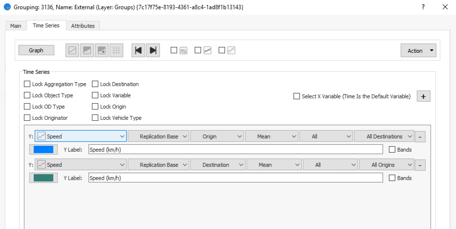
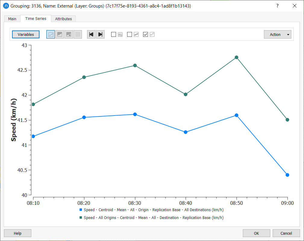
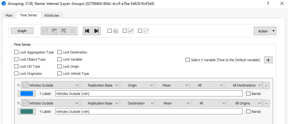
To view statistics for the Internal and External groupings, click their Time Series tabs to set variables and view graphs as you have done with previous objects.
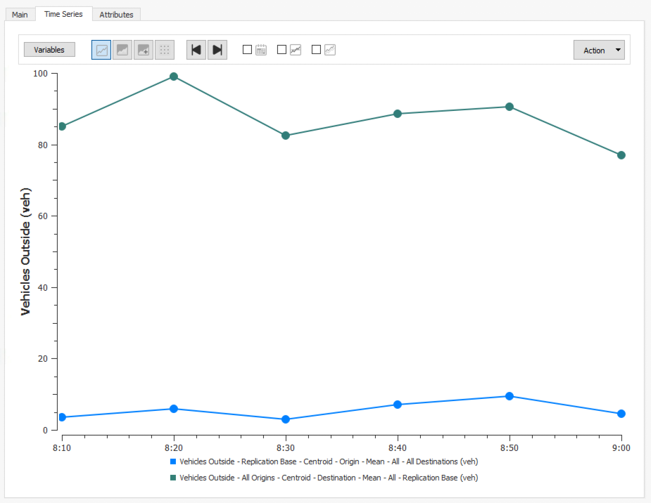
The first two screenshot below show the average speed of all of the vehicles with an external centroid as either their origin or their destination.
The next two screenshots show the number of vehicles that leave from or travel to internal centroids.
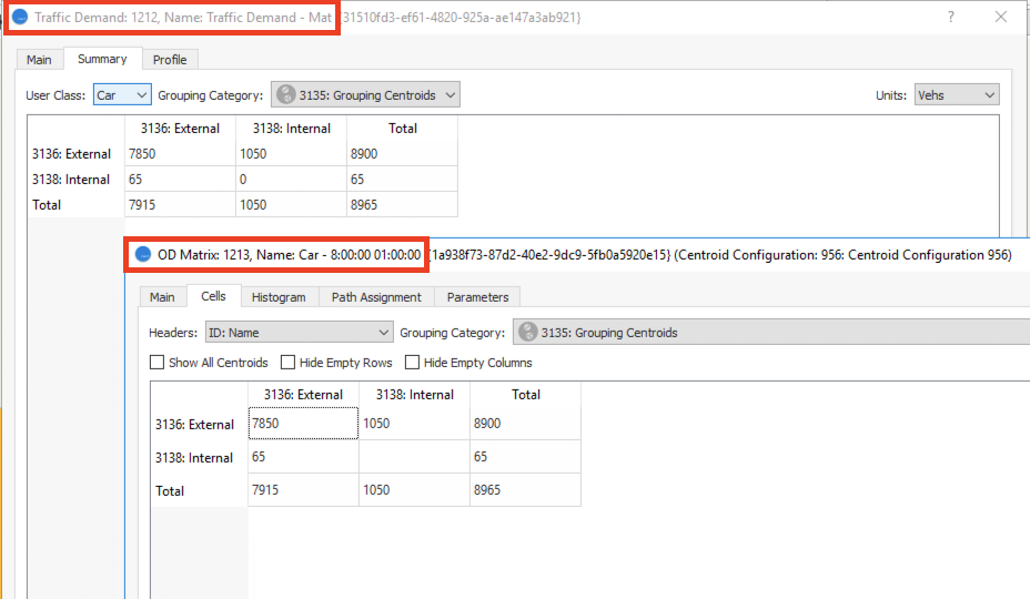
Now we have these groupings we can use them to aggregate the traffic demand matrices.
To aggregate the traffic demand:
-
Open the traffic demand object and click the Summary tab.
-
From the Grouping Category drop-down list, select Grouping Centroids.
You can also open an OD matrix editor, click the Cells tab, and select the Grouping Category. Both options are illustrated below.
Exercise 13. Viewing Outputs with Print Layout
A print layout is a graphical presentation containing various statistical outputs. After creating a print layout you can print it, export it as a PDF, or export it as an image file. You can also save it as a template for use with other projects.
In this exercise, we will present two elements:
- Map: a network view, incorporating view modes
- Graph: a time series
To create a print layout and add a map:
-
In the Project folder, right-click Data Analysis > New > Print Layout.
-
Open the new print layout object to display the initial dialog, which features a map (snapshot of the center of the network). If this snapshot is suitable, you can go to step 4.
-
Click on the map and, using pan and zoom, select the part of the network you want to display.
-
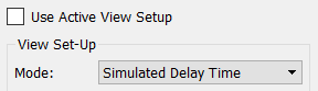
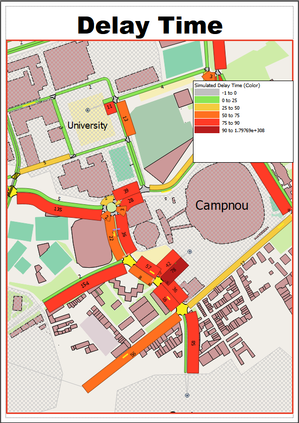
If you want to use a different view mode to the one automatically selected, untick Use Active View Setup and select from the Mode drop-down list. For this exercise, select Simulated Delay Time.
-
To add a legend to the map, click
. The legend contains the correct information related to the view mode. -
Click and drag the legend to reposition it, making sure not to obscure any important details on the map.
-
To add a title to the map, click
 to place a text box on the map. Drag it to the top of the print layout. You might need to click and drag the map to make room for the title.
 -
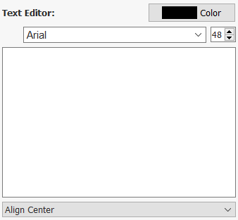
In the right-hand column, use the Text Editor to type in the title, select a color, font, point size, and align it left, right or center. Use the screenshots below as a guide.
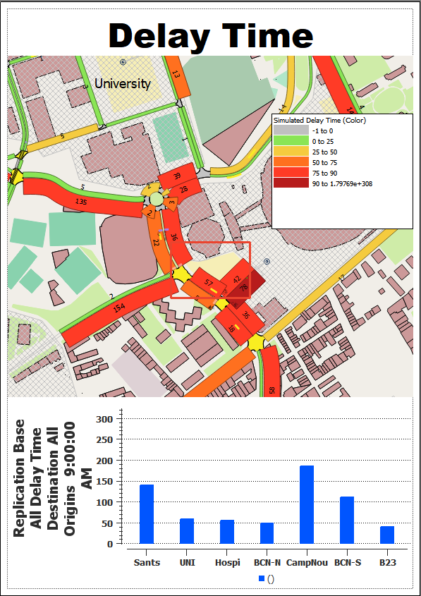
Now we will add a time series graph to the print layout. We will select the seven centroids in the network and select Delay Time by Destination as the variable.
To add a graph to the print layout:
-
Click
 to add a graph box to the print layout.
 -
Click on the graph box to display the Time Series Viewer dialog.
-
In the 2D view, select all seven centroids.
-
In the Time Series Viewer dialog, select Delay Time and Destination in the variable.
-
Click Add Series and click
 to display the data in a chart. You might need to move and resize the graph box to make it legible and move it to the correct place.
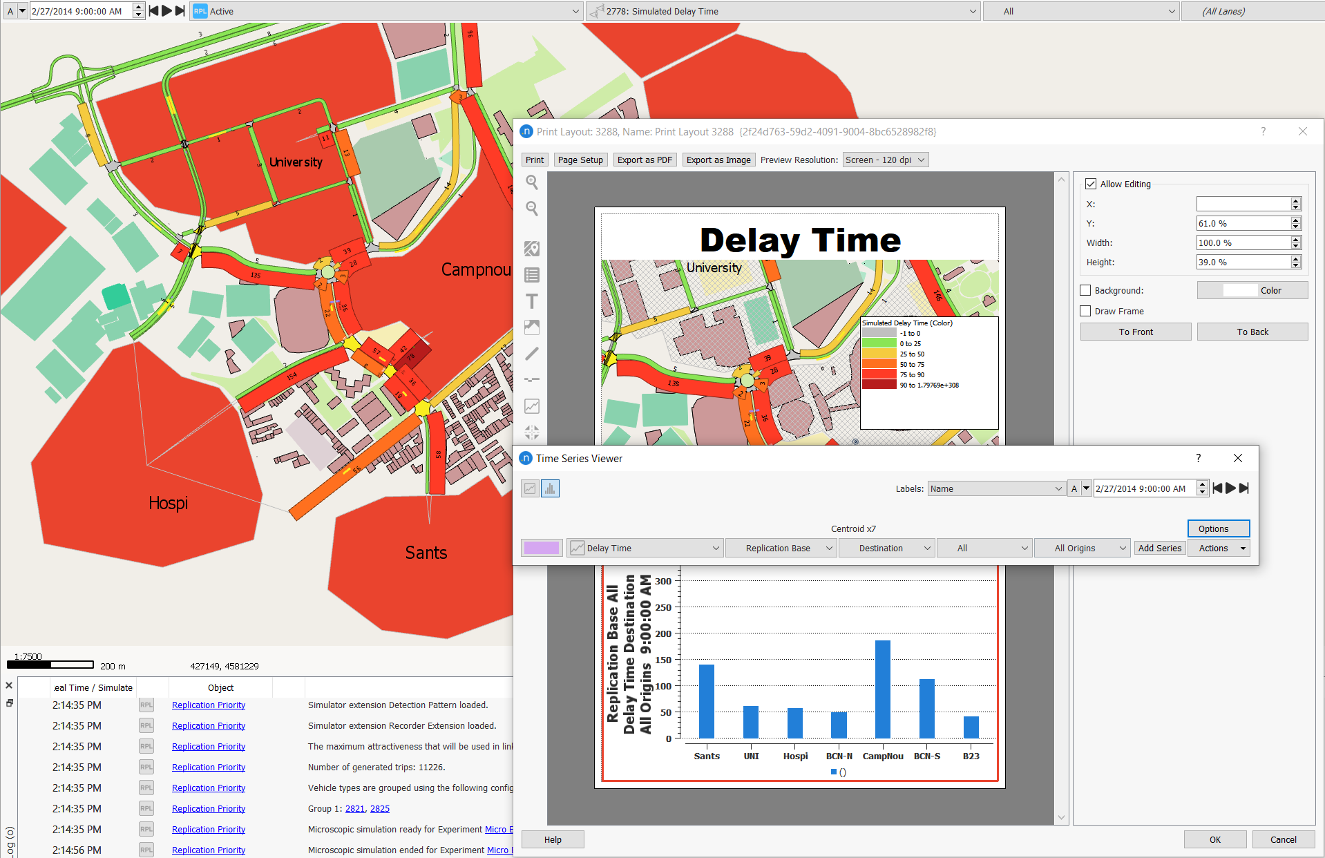
The final print layout should resemble the screenshot below.
Using the buttons at the top of the dialog, you can now print it, export it as a PDF or export it as an image file. The print layout is now stored in the model and can be reused, for example, if you want to change the replication, average, or real data set used to generate the data.
Exercise 14. Comparing Data
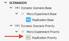
The Data Comparison option allows you to view and compare the results of two simulations, showing the relative and absolute differences. To have data to compare, we need to first simulate the complementary scenario in the network (Dynamic Scenario Priority).
To compare data:
-
In Scenarios, right-click Replication Priority > Run Batch Simulation. Note: A batch simulation is the fastest type of simulation: it does not display animations and cannot be paused, but only cancelled.
-
From the main menu bar, select Data Analysis > Data Comparison to open the Data Comparison dialog.
-
In the top Reference field, select Replication Base and in the Compared field, select Replication Priority.
-
In the lower Reference, select Delay Time, as shown below.
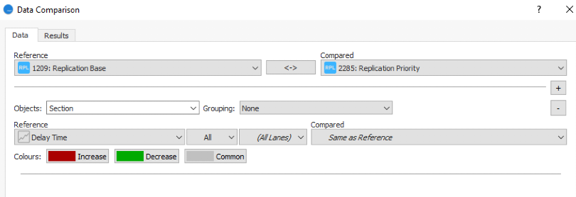
-
Click Compare to see the results.
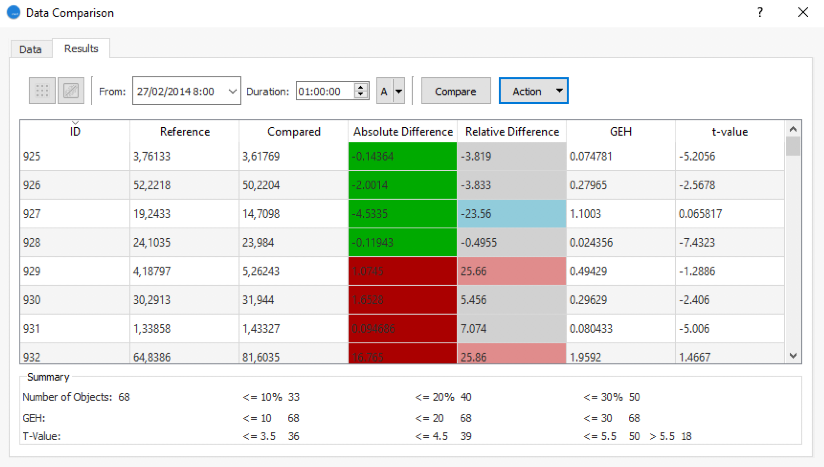
On the Results tab, the delay time values of the sections are displayed in a table with the absolute and relative differences highlighted, as shown below.
-
Optional: If you want to save this data comparison, click the Data tab and then click Save.
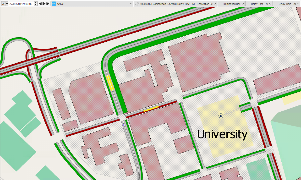
A new folder named Data Comparisons is added to Data Analysis in the Project folder. A new view mode is also created to visualize the results in the model. It will be prefixed with Comparison.
-
Optional: Select the comparison view mode. It visualizes a section-by-section comparison.
Sections marked as green experienced a lower delay time in the experiment that includes tram priority. The tram sections are marked as green because they have absolute priority. Access points to nodes in the visualization now have less green time, meaning longer delay times. This is why they are marked in red.